Is it just me or does the majority of this stuff not even look like Lululemon anymore...
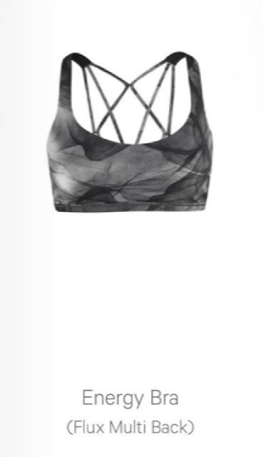
Ooh-la-lace allover print black energy bra looks really pretty but only the Ta Ta Tamers work for me, so hopefully it will come in this print/colour combo (I won't be holding my breath though).
This seriously had me rolling my eyes. When we say we want some of the amazing stuff Lululemon had done in the past, we don't mean Ombré space dye! We're over it already!
Zzzzzzzz. Seems odd to discourage more purchases with such a monotonous collection. I don't even think people that are mostly enamored with this stuff will want more than one or two things because it's all so similar (and boring to boot).
You could slap another company's logo on any of these clothes, and we'd never know the difference. Lulu has lost alot of what used to make them distinctive - saturated colors, functional yet pleasing details, unique aesthetic design. The ghostly way the garments are displayed doesn't help either. I thought they had brought back showing models actually wearing the clothes?
I agree I was in my local lulu and was so disappointed.Their scubas where always so nice now they look like Walmart hoodies. Black and grey as well so many dull colors and patterns honestly
If you really want to get upset, go to Ivivva. It's like stepping into a time warp. All "old Lulu" styling, but with a catch: it's miniature, so you can't have it! I seriously almost got tears in my eyes the last time I was in there. I was like, "this is what I want. This is what I used to have. Why did they take it away?"
J Crew is the same way. Their womens' line has gotten awful but I love so much of what I see in crewcuts (not all the sequins and glitter tho!) But some of the dresses I would take in my size in a heartbeat....
Agree that the designs look boring, but at least the midnight tulle print looks more appealing to me than any of the recent prints. Not happy to see all these new designs coming out. I know that sounds odd, but I want more of the classics to be re-released. And I agree that this stuff looks nothing like Lululemon. Usually when brands bring in a new designer they take pains to make sure there's continuity. Not really seeing it.
It's not so much the black that is bothering me because I am sure there will be a few colours added to each but it doesn't really matter because I absolutely do not like 95% of what I see. The jackets/crews/vest either look like they could be found in the men's section, or a star trek movie as mentioned above and it looks like spacer fabric is not going away. The only piece that I may be interested in is the Run For Cold Pullover. Looks like I will have to go elsewhere for a few more winter pieces I am needing.
Under Armour Cold Gear has some amazing pieces. I bought a few last winter for the reasons you stated and they turned out to be my favorite pieces. I even grabbed them over my Lulu pieces :O
Thanks I will check them out. We also have the Running Room which carries many good brands and their Winter Catalogue just came out. What a sad collection this is.
So many shades of gray. It's horrible. Definitely doesn't look like lulu. At least not the lulu I fell in love with. I haven't bought anything in months. Looks like that will continue.
I'm interested in the Featherlight Tight and the Midnight Tulle print. But really, enough with black & white. And I LOVE black & white prints. But it's all starting to look like "same song, different verse."
same here, lulubell. I too miss the feminine details and the feminine fit. great description for the new tops and jackets, haha - so boxy and unisex looking!
@lulubell yes! What a great way to describe it! Gov issued! I do like the midnight tulle print and I also like the oh la lace print. ( not even sure why) however, I have the Dottie tribes and shibori so more black white grey...I can't justify to my budget more of these shades. O/T I did buy the rush hour jacket on MD tonight. I have the Kanto Jacket in Ultra Violet but after wearing it twice I realized that it is too tight in the chest for me. I needed a replacement bit wasn't prepared to pay full price. I prefer the design on the Kanto but the rush hour works much better for my body type. Am going to sell the Kanto for $60. Size 6. If anyone interested they can email me at bloomingspirits@hotmail.com Hope it's okay that I said that LLM!
Yikes. I'm starting to lose hope that we'll ever see anything close to a return to older lulu designs and colours. Like most on here, my wardrobe is 95% lulu. I love the versatility of the pieces and can often dress up my workout gear easily. I'm not quite sure what market they're trying to appeal to lately? Definitely not their standard buyers. Whatever they've been doing has completely missed the mark. In 10 years of following this brand, I've never seen such a huge selection of sale items and so many full size runs online. Like lots have said before, I haven't bought in months (besides 1 WMTM purchase) after years of buying at almost every upload!
Disappointed to see that the trend we've been seeing will continue through the winter. At least my money is safe!
I am very disappointed. Dull designs and colors. Honestly, if Lulu just revived some old designs in a pretty color story/pattern, I would be happy. At this point, I don't even want them to be "innovative" -- Spacer fabric, no thanks. They don't even need to dip far back in the vaults. I would scoop up more than one Scuba II or original CRB/DSP, for example. I also yearn for the return of the Be Present Jacket (I think from 2 years ago) since I found it very versatile and flattering and it had only a limited run.
There is an enormous LLL opening in London in 'winter' - they're not being more specific than that - which is going to be the European flagship store with THREE FLOORS of LLL. I had big visions of rocking up there and spending a glorious afternoon mulling over some wonderful new additions but now I'm a bit worried the entire store is going to be monochrome.
I don't want to pour sunshine on this gloomy thread, but do remember this is a design doc. There may be some glorious color hiding behind the black and white mock-ups. It looks like there are some great new running tights like the Sleek Sprinter, Fast and Free and Free Runner. I've been hoping for those since I don't like the new Speed Tights. The Run for Cold capsule also looks pretty awesome and I'm sure (I hope!) it will run some nice colors. You can smack me and call me an ed later if I'm wrong. ;) I hope I'm not! I really like some of these styles.
Ah how sweet some people are to be optimistic there is some colour coming. Come on, take off your blinders! This is a Look Book, what better time to feature that this is some colour?! You don't keep that hidden, that's the biggest mistake you can make.
I agree with others that there is nothing at all special about this collection - zero, zilch, nada. There is nothing that indicates it is LLL in the way that their clothing designs and features of the past incorporated, even in subtle ways. This stuff is just plain boring and non-special. I could care less what alleged high end designers they worked with the were part of this. This is the best you can do? Sorry, easy pass.
I'm relieved, in a way, haha. The more I extricate myself from this brand, the better. Job 1 LLL for making it easier and easier!
I could be wrong but I thought I remembered one of the earnings call or an interview where Potdevin stated that black/white/gray were going to be a huge part of their designs with little color? Maybe I dreamed it? Nightmare? Lol! But dang, I swear I remember something along the lines of this that I read somewhere....
Yes, I remember reading about this here on Lulumum's blog, anon 5:10.
and, I agree with you anon 3:57. Nothing special here and nothing that stands out and sets this apart from the rest like LLL used to do so well. It looks like they have even taken on the same kind of fit to the clothes as the rest... a shapeless and unisex looking fit... so sad, as the feminine fit was one of the biggest reasons I loved Lulu, it was shaped to flatter women's bodies so well.
I also remember hearing that more somber colors were on the way -- maybe on this very blog.
Three things attracted me to LLL: FUN COLORS. FLATTERING FIT. FUNCTIONALITY. The design details (whether ruffles or hidden LLL symbols in the patterns to name a few) were excellent extras. I feel as if those extras will never return -- the company has gotten too big for to invest the time and $$ into the details maybe. I fear the fun colors, fit and functionality are on their way out as well. It's both a little good, and sad, that I no longer look to LLL to give me a weekly lift.
I have to say I'm a little disappointed. I'm very petite and the hi-rise just does not work for me. I don't find them to be flattering or comfortable to wear. If the Shibori print came in mid-rise I would have been more interested. I do like the Ombre WU but it's also hi-rise. Does everyone really like hi-rise? Is it just me?
High rise is awful and too big at the waist for me. The proportions also tend to be off and lend themselves to the "long butt" effect. Not cute, not flattering.
I don't like high rise either. Original Wunder Unders and original Groove Pants waistbands are perfect, imo. They are just the right height, not too low, not too high - just perfect, flattering and comfy.
While there are a couple of items of interest, it's all very gloomy and somber. I need some warm run tights so the sleet ones may be good if they come in something other than black. I already own basic cold gear black tights - don't need more...
The nice thing about Lululemon is that if these are not your cup of tea, just wait a few weeks and they will probably upload something you like eventually!
I agree with you! That's why I'm not complaining if I'm not seeing what I like. I know there'll be something next time. I'm actually glad I'm not liking everything, I don't want to be broke lol


Is it just me or does the majority of this stuff not even look like Lululemon anymore...
ReplyDeleteOoh-la-lace allover print black energy bra looks really pretty but only the Ta Ta Tamers work for me, so hopefully it will come in this print/colour combo (I won't be holding my breath though).
Very Black!! And I like black but seriously enough already
ReplyDeleteI imagine this is what my dogs see when they look at me heading out the door.
ReplyDeleteAhaha you had me rolling with laughter!!!! Same though.. I feel the same!!!
Delete@dogrunner, too funny. Thanks for making me laugh.
DeleteI love the greys don't get me wrong but we do want some color, too... Forest green, dark blues or purples?
ReplyDeleteOmbré space dye wunder unders ��
ReplyDeleteThis seriously had me rolling my eyes. When we say we want some of the amazing stuff Lululemon had done in the past, we don't mean Ombré space dye! We're over it already!
Delete50 shades of gray lulu...really? We want more color! Grrr.
ReplyDeleteZzzzzzzz. Seems odd to discourage more purchases with such a monotonous collection. I don't even think people that are mostly enamored with this stuff will want more than one or two things because it's all so similar (and boring to boot).
ReplyDeleteIs this the wardrobe from the original Star Trek?
ReplyDeleteYou could slap another company's logo on any of these clothes, and we'd never know the difference. Lulu has lost alot of what used to make them distinctive - saturated colors, functional yet pleasing details, unique aesthetic design. The ghostly way the garments are displayed doesn't help either. I thought they had brought back showing models actually wearing the clothes?
ReplyDeleteI agree I was in my local lulu and was so disappointed.Their scubas where always so nice now they look like Walmart hoodies. Black and grey as well so many dull colors and patterns honestly
DeleteIf you really want to get upset, go to Ivivva. It's like stepping into a time warp. All "old Lulu" styling, but with a catch: it's miniature, so you can't have it! I seriously almost got tears in my eyes the last time I was in there. I was like, "this is what I want. This is what I used to have. Why did they take it away?"
DeleteJ Crew is the same way. Their womens' line has gotten awful but I love so much of what I see in crewcuts (not all the sequins and glitter tho!) But some of the dresses I would take in my size in a heartbeat....
DeleteI just hope we don't see anymore of that horrid neoprene-like material. so boxy and not flattering.
ReplyDeleteAre you referring to the fabric that Embrace the space hoodie made of? I bought it and love it, the most amazing fabric ever
DeleteAgree that the designs look boring, but at least the midnight tulle print looks more appealing to me than any of the recent prints. Not happy to see all these new designs coming out. I know that sounds odd, but I want more of the classics to be re-released. And I agree that this stuff looks nothing like Lululemon. Usually when brands bring in a new designer they take pains to make sure there's continuity. Not really seeing it.
ReplyDeletewell this is depressing, almost no colour and plain designs imo.
ReplyDeleteIt's not so much the black that is bothering me because I am sure there will be a few colours added to each but it doesn't really matter because I absolutely do not like 95% of what I see. The jackets/crews/vest either look like they could be found in the men's section, or a star trek movie as mentioned above and it looks like spacer fabric is not going away. The only piece that I may be interested in is the Run For Cold Pullover. Looks like I will have to go elsewhere for a few more winter pieces I am needing.
ReplyDeleteUnder Armour Cold Gear has some amazing pieces. I bought a few last winter for the reasons you stated and they turned out to be my favorite pieces. I even grabbed them over my Lulu pieces :O
DeleteThanks I will check them out. We also have the Running Room which carries many good brands and their Winter Catalogue just came out. What a sad collection this is.
DeleteWhat are these pieces made of? I would be interested in the hoodie if it's rulu or fleece, and if it comes in a color.
ReplyDeleteSo many shades of gray. It's horrible. Definitely doesn't look like lulu. At least not the lulu I fell in love with. I haven't bought anything in months. Looks like that will continue.
ReplyDeleteI'm interested in the Featherlight Tight and the Midnight Tulle print. But really, enough with black & white. And I LOVE black & white prints. But it's all starting to look like "same song, different verse."
ReplyDeleteI miss the Ruffles and the unique designs that said Lulu from a mile away. Oh I miss the old Lulu designs and quality.
ReplyDeleteagree with you completely.
DeleteI miss the ruffles and feminine fit of the pieces. The tops and jackets look like government-issued clothing in a dystopian society.
ReplyDeletesame here, lulubell. I too miss the feminine details and the feminine fit. great description for the new tops and jackets, haha - so boxy and unisex looking!
Delete@lulubell yes! What a great way to describe it! Gov issued! I do like the midnight tulle print and I also like the oh la lace print. ( not even sure why) however, I have the Dottie tribes and shibori so more black white grey...I can't justify to my budget more of these shades.
ReplyDeleteO/T I did buy the rush hour jacket on MD tonight. I have the Kanto Jacket in Ultra Violet but after wearing it twice I realized that it is too tight in the chest for me. I needed a replacement bit wasn't prepared to pay full price. I prefer the design on the Kanto but the rush hour works much better for my body type.
Am going to sell the Kanto for $60. Size 6. If anyone interested they can email me at bloomingspirits@hotmail.com
Hope it's okay that I said that LLM!
Absolutely! Go for it!
DeleteSent you an email 😊
DeleteYikes. I'm starting to lose hope that we'll ever see anything close to a return to older lulu designs and colours. Like most on here, my wardrobe is 95% lulu. I love the versatility of the pieces and can often dress up my workout gear easily.
ReplyDeleteI'm not quite sure what market they're trying to appeal to lately? Definitely not their standard buyers. Whatever they've been doing has completely missed the mark. In 10 years of following this brand, I've never seen such a huge selection of sale items and so many full size runs online. Like lots have said before, I haven't bought in months (besides 1 WMTM purchase) after years of buying at almost every upload!
Disappointed to see that the trend we've been seeing will continue through the winter. At least my money is safe!
I am very disappointed. Dull designs and colors. Honestly, if Lulu just revived some old designs in a pretty color story/pattern, I would be happy. At this point, I don't even want them to be "innovative" -- Spacer fabric, no thanks. They don't even need to dip far back in the vaults. I would scoop up more than one Scuba II or original CRB/DSP, for example. I also yearn for the return of the Be Present Jacket (I think from 2 years ago) since I found it very versatile and flattering and it had only a limited run.
ReplyDeleteThere is an enormous LLL opening in London in 'winter' - they're not being more specific than that - which is going to be the European flagship store with THREE FLOORS of LLL. I had big visions of rocking up there and spending a glorious afternoon mulling over some wonderful new additions but now I'm a bit worried the entire store is going to be monochrome.
ReplyDeleteI don't want to pour sunshine on this gloomy thread, but do remember this is a design doc. There may be some glorious color hiding behind the black and white mock-ups. It looks like there are some great new running tights like the Sleek Sprinter, Fast and Free and Free Runner. I've been hoping for those since I don't like the new Speed Tights. The Run for Cold capsule also looks pretty awesome and I'm sure (I hope!) it will run some nice colors. You can smack me and call me an ed later if I'm wrong. ;) I hope I'm not! I really like some of these styles.
ReplyDeleteYes!!! I can't wait to see what colors the Fleece Be True comes in. I think you are right.
DeleteI agree, there will be colors mixed in with these basic b and white items. I'm sure many of these are lovely IRL!
ReplyDeleteAh how sweet some people are to be optimistic there is some colour coming. Come on, take off your blinders! This is a Look Book, what better time to feature that this is some colour?! You don't keep that hidden, that's the biggest mistake you can make.
ReplyDeleteI agree with others that there is nothing at all special about this collection - zero, zilch, nada. There is nothing that indicates it is LLL in the way that their clothing designs and features of the past incorporated, even in subtle ways. This stuff is just plain boring and non-special. I could care less what alleged high end designers they worked with the were part of this. This is the best you can do? Sorry, easy pass.
I'm relieved, in a way, haha. The more I extricate myself from this brand, the better. Job 1 LLL for making it easier and easier!
I could be wrong but I thought I remembered one of the earnings call or an interview where Potdevin stated that black/white/gray were going to be a huge part of their designs with little color? Maybe I dreamed it? Nightmare? Lol! But dang, I swear I remember something along the lines of this that I read somewhere....
DeleteYes, I remember reading about this here on Lulumum's blog, anon 5:10.
Deleteand, I agree with you anon 3:57. Nothing special here and nothing that stands out and sets this apart from the rest like LLL used to do so well. It looks like they have even taken on the same kind of fit to the clothes as the rest... a shapeless and unisex looking fit... so sad, as the feminine fit was one of the biggest reasons I loved Lulu, it was shaped to flatter women's bodies so well.
I also remember hearing that more somber colors were on the way -- maybe on this very blog.
DeleteThree things attracted me to LLL: FUN COLORS. FLATTERING FIT. FUNCTIONALITY. The design details (whether ruffles or hidden LLL symbols in the patterns to name a few) were excellent extras. I feel as if those extras will never return -- the company has gotten too big for to invest the time and $$ into the details maybe. I fear the fun colors, fit and functionality are on their way out as well. It's both a little good, and sad, that I no longer look to LLL to give me a weekly lift.
Is there any good reason you feel it necessary to insult people because they don't agree with you? Just wow.
DeleteSorry, but where are people being insulted? Stop looking to be offended. Corporations aren't your friends.
DeleteLooks like WMTM is about to get overloaded again.
ReplyDeleteI have to say I'm a little disappointed. I'm very petite and the hi-rise just does not work for me. I don't find them to be flattering or comfortable to wear. If the Shibori print came in mid-rise I would have been more interested. I do like the Ombre WU but it's also hi-rise. Does everyone really like hi-rise? Is it just me?
ReplyDeleteNope. Hate high rise. I find them uncomfortable. I'm not petite either. I haven't bought anything because everything is High Rise at this point.
DeleteHigh rise is awful and too big at the waist for me. The proportions also tend to be off and lend themselves to the "long butt" effect. Not cute, not flattering.
DeleteI don't like high rise either. Original Wunder Unders and original Groove Pants waistbands are perfect, imo. They are just the right height, not too low, not too high - just perfect, flattering and comfy.
DeleteI love high rise - they are great for yoga practice and the gym. I never have to worry my underwear is peeking out and they just stay put much better.
DeleteI love high rise as well. Works great smoothening everything out, no muffin top
DeleteWhile there are a couple of items of interest, it's all very gloomy and somber. I need some warm run tights so the sleet ones may be good if they come in something other than black. I already own basic cold gear black tights - don't need more...
ReplyDeleteThe nice thing about Lululemon is that if these are not your cup of tea, just wait a few weeks and they will probably upload something you like eventually!
ReplyDeleteI agree with you! That's why I'm not complaining if I'm not seeing what I like. I know there'll be something next time. I'm actually glad I'm not liking everything, I don't want to be broke lol
Delete